
Ninety percent of websites are now responsive (Hostinger, 2025). That means the vast majority of sites correctly scale their layout across screen sizes. And yet 81% of websites still perform poorly on mobile UX (Loopex Digital, 2026). That gap is the problem. Responsive design solved layout. It did not solve load speed, navigation intuitiveness, interaction responsiveness, or personalization. Users in 2025 expect fast-loading, intuitive, context-aware experiences not just content that fits on screen. When a mobile visitor waits more than four seconds for a page to load, 63% leave (Loopex Digital, 2026). When navigation feels designed for a mouse rather than a thumb, they leave. When the content shown is identical regardless of who they are or why they visited, they leave. This article explains exactly why responsive design keeps failing despite near-universal adoption, and what specific fixes close each gap. For a broader overview of the SEO connection, the SEO-friendly website design guide covers the technical and structural requirements together.
TL;DR: Responsive design solves one problem layout but modern mobile UX requires solving four more: speed, intuitiveness, interaction responsiveness, and personalization. Only 48% of mobile websites pass Core Web Vitals in 2025 (HTTP Archive, 2025). The fix is not more responsive CSS. It is treating responsive layout as one layer of a complete mobile experience strategy, then addressing each remaining layer deliberately.
Why Responsive Design Is Incomplete, Not Wrong
Responsive design is correct. It is just not enough. When Ethan Marcotte introduced the concept in 2010, the goal was clear: one codebase that adapts its layout to any screen size. That goal was achieved. CSS media queries, flexible grids, and fluid images became standard practice. Today, 90% of websites implement responsive design (Hostinger, 2025), and Google completed its transition to mobile-first indexing in 2023.
Launch Your App Today
Ready to launch? Skip the tech stress. Describe, Build, Launch in three simple steps.
BuildBut the web has moved. The problem users face on mobile in 2025 is not primarily “content that does not fit the screen.” It is content that fits the screen but loads slowly, navigation that fits the screen but requires too many taps, interaction elements that fit the screen but respond sluggishly, and content that fits the screen but is irrelevant to why this specific user visited.
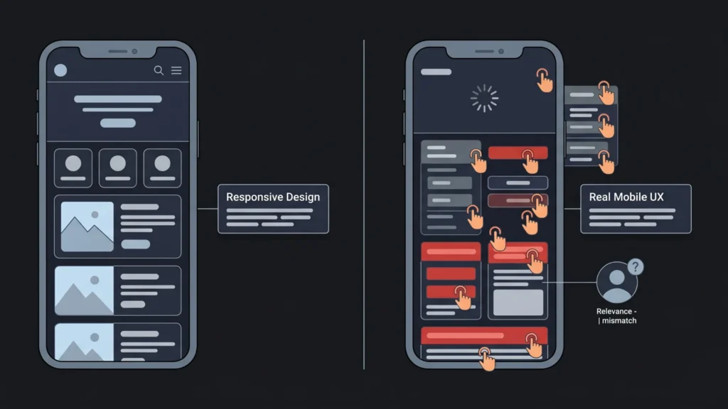
Responsive design is a layout model. Modern mobile UX is an experience model. Layout is one layer of experience. Speed, intuitiveness, interaction responsiveness, and relevance are four more layers. Responsive design handles the first layer. It says nothing about the others. That is why 81% of websites perform poorly on mobile UX despite near-universal responsive implementation (Loopex Digital, 2026). The layout problem was solved. The other four were not addressed.
The reason responsive design failure is so persistent is that it is invisible to the people building websites. A developer or site owner checking their site on a phone sees the layout adapt correctly. The content fits. Nothing looks broken. The failure is in the experience the slow load, the awkward navigation, the irrelevant content which requires measuring user behavior, not just visual inspection. Sites that look responsive are frequently not experienced as responsive by real users.
Citation capsule: According to HTTP Archive’s 2025 Web Almanac, only 48% of mobile websites pass Core Web Vitals on mobile as of July 2025, compared to 56% on desktop. Mobile Core Web Vitals performance has improved from 36% in 2023 to 44% in 2024 to 48% in 2025, but the majority of mobile websites still fail Google’s performance benchmarks despite near-universal responsive design adoption (HTTP Archive / Chrome UX Report, 2025).
Problem 1: Responsive Design Does Not Fix Speed
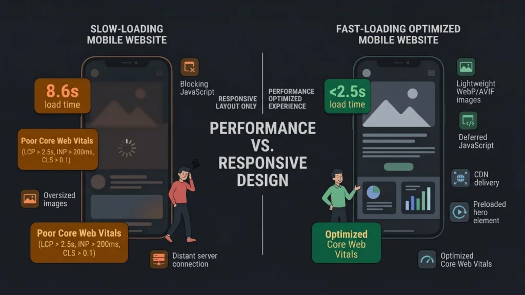
The most damaging gap between responsive layout and mobile user experience is page speed. A responsive site that takes eight seconds to load on mobile is worse than a non-responsive site that loads in two. The layout adaptation is irrelevant if the user has already left.
The average website load time in 2025 is 2.5 seconds on desktop and 8.6 seconds on mobile (JS Interactive, 2025). That gap exists because mobile networks are slower, mobile CPUs are less powerful, and most websites are built and optimized primarily on desktop. Images are served at desktop resolution. JavaScript bundles are served in full. Fonts load synchronously. None of these issues are addressed by responsive CSS.
According to Google’s Core Web Vitals standards, a good Largest Contentful Paint (LCP) the time for the main visible content to render is under 2.5 seconds. A good Interaction to Next Paint (INP) the time from user input to the next rendered frame is under 200 milliseconds. A good Cumulative Layout Shift (CLS) measuring visual stability is under 0.1 (Google Search Central, 2025). As of 2025, only 48% of mobile websites meet all three thresholds.
Fixes for Speed
Serve responsive images, not just responsive layouts. The srcset attribute and <picture> element serve different image sizes to different screen sizes and pixel densities. A desktop user gets a 1920px-wide hero image. A mobile user on a 375px-wide screen gets a 750px-wide image at 2x density. This alone can reduce page weight by 50 to 70% on mobile.
Convert images to WebP or AVIF. Modern image formats reduce file size by 25 to 50% compared to JPEG at equivalent visual quality. Every major browser supports WebP. AVIF support is growing. This is a zero-tradeoff performance improvement.
Preload the LCP element. The largest visible content element typically a hero image or heading should be identified and preloaded in the document head with a <link rel="preload"> tag. This tells the browser to fetch it immediately rather than waiting for the HTML parser to encounter it during normal page load.
Defer render-blocking JavaScript. Scripts loaded in the document head block rendering until they complete. Adding defer or async attributes to non-critical scripts allows the browser to render the page content while scripts load in parallel. This is one of the most impactful single changes for LCP on mobile.
Use a CDN for all static assets. Serving images, fonts, and scripts from a geographically distributed content delivery network reduces the distance data travels to reach each user. A user in Mumbai accessing a server in Virginia adds approximately 150 to 200ms of network latency before the first byte arrives. A CDN eliminates most of that.
The website redesign costs, strategy, and SEO tips guide covers the full audit process for identifying speed problems and prioritizing the fixes by impact.
Citation capsule: According to Loopex Digital’s 2026 web design statistics, when mobile pages take over 4 seconds to load, 63% of users leave. At 6 seconds, about 66% have gone. Each extra second of delay reduces conversions by approximately 7%. The probability of a bounce increases by 32% when page load time increases from 1 to 3 seconds (Loopex Digital / WP Rocket, 2025–2026). Speed is not a performance optimization it is the baseline threshold for user retention.
Problem 2: Responsive Design Does Not Fix Navigation Intuitiveness
Responsive design adapts layout. It does not redesign navigation for touch. A site with a desktop navigation menu that collapses into a hamburger menu on mobile has technically implemented responsive design. It has not necessarily created good mobile navigation. The hamburger menu is three taps away from any destination. On a phone, that is three times more friction than desktop users experience.
Navigation issues cause 30 to 40% of mobile usability problems (Loopex Digital, 2026). Users leave if they cannot find what they need within 10 to 15 seconds. The core failure is that most responsive navigation is desktop navigation compressed into a smaller space, not mobile navigation designed for thumb reach, screen context, and interaction urgency.
Fixes for Navigation Intuitiveness
Design for thumb zones. The bottom third of the screen is the easiest area for right-handed thumb reach. The top left corner is the hardest. Primary navigation and conversion actions should be placed in the natural thumb zone, not in top bars that require a full-hand stretch or two-handed use.
Reduce navigation depth. Every additional level of navigation hierarchy on mobile adds friction. A three-level menu that works reasonably well on desktop becomes a confusing series of taps on mobile. Flatten navigation to two levels maximum for mobile. If your information architecture requires more depth, use search as a navigation tool rather than nested menus.
Make tap targets large enough. Google’s minimum recommended tap target size is 48px by 48px with 8px spacing between adjacent targets. Many sites fail this on mobile, creating buttons and links that are too small to tap accurately without zooming. Poor tap target sizing is a direct contributor to INP failures users tap the wrong element, get an unexpected result, and register the interaction as an error.
Provide persistent access to key actions. On mobile, sticky headers or bottom navigation bars that keep primary actions (contact, cart, book) visible without scrolling perform better than navigation that disappears when users scroll down. Users on mobile scroll frequently. If your conversion action is only accessible from the top of the page, you lose it the moment they start browsing.
Citation capsule: According to JS Interactive (2025) citing Google Ads Help data, users are five times more likely to abandon a site if it is not mobile-optimized. 84% of visitors expect mobile sites to be as good as desktop sites (Wonderful.io, 2024). 57% of users say they would not recommend a business with a poor mobile site (Forbes Advisor, 2025). Navigation quality is not a UX nicety it is a direct predictor of whether users stay or leave (JS Interactive, 2025).
Problem 3: Responsive Design Does Not Fix Interaction Responsiveness
Layout responsiveness and interaction responsiveness are different things. A site can adapt its layout perfectly to a phone screen and still feel sluggish when users tap buttons, open dropdowns, or submit forms. That sluggishness is what INP measures.
Google’s INP threshold under 200ms from user input to the next painted frame reflects how fast an interaction must feel to be perceived as instant by users. Research in human-computer interaction consistently shows that responses under 100ms feel immediate, 100 to 300ms feel fast, and anything above 300ms is perceptibly slow. At above 1 second, users wonder if the interface registered their tap at all.
Most responsive design work focuses entirely on layout: does the element appear in the right place on the screen? It does not address the JavaScript execution that fires when a user taps that element, the rendering pipeline that updates the visual state after the interaction, or the thread contention that blocks visual updates when multiple JavaScript tasks are running simultaneously.
Fixes for Interaction Responsiveness
Move long JavaScript tasks off the main thread. The browser’s main thread handles both JavaScript execution and rendering. Long-running JavaScript tasks anything over 50ms block rendering during their execution. Web Workers allow JavaScript computation to run on a separate thread, keeping the main thread available for rendering after user interactions.
Reduce third-party script impact. Analytics, advertising, chat widgets, and marketing automation tools add JavaScript to pages that runs on the main thread. Each script competes for rendering bandwidth. Audit every third-party script on your site. Remove the ones that are not actively contributing value. Load the rest using defer or by moving them to load after the initial page render completes.
Implement passive event listeners. Touch event listeners that do not call preventDefault() should be declared as { passive: true }. This tells the browser it does not need to wait for the event handler to complete before processing scroll events, significantly improving scroll performance on mobile.
The cross-browser compatibility issues guide covers the full spectrum of interaction failures that responsive design does not address, including touch event behavior differences across iOS Safari and Android Chrome.
Citation capsule: According to Google Search Central (2025), the Core Web Vitals standard for INP is under 200 milliseconds. This threshold was set based on research showing that interactions above 200ms are perceptibly slow to users. Interaction to Next Paint replaced First Input Delay in March 2024 as a more comprehensive measure of real-world responsiveness, capturing all interactions throughout a session rather than only the first one (Google Search Central / Web.dev, 2024–2025).
Problem 4: Responsive Design Does Not Fix Context-Awareness
A responsive website shows the same content to every user regardless of how they arrived, where they are, what device they are using, what time of day it is, or what they have done before. Responsive design adapts the visual presentation. It does not adapt the content.
Modern user expectations have moved beyond layout adaptation. According to a McKinsey Digital Study, AI-powered personalization increases conversion rates by up to 30% and user satisfaction by over 40% (cited by Big Orange Planet, 2025). Sayenko Design (2026) observes that a first-time visitor arriving from a paid search ad for a specific service expects to see that service prominently, not the same homepage every other visitor sees.
This is not a responsive design failure in the technical sense. Responsive design was never designed to address content relevance. But the practical result is that sites built on responsive design as their primary user experience strategy are missing the context-adaptation dimension that users increasingly expect.
Fixes for Context-Awareness
Implement basic behavioral segmentation. The minimum viable personalization layer is distinguishing between a new visitor and a returning visitor. New visitors benefit from introductory messaging, social proof, and clear value propositions. Returning visitors already know what you do and benefit more from reminders of incomplete actions, new content, or personalized recommendations based on previous behavior.
Use referral source to set context. A visitor arriving from a specific Google ad, an email campaign, or a social media post has a known intent context. UTM parameters capture this information. Using that context to adjust the hero headline, the primary call-to-action, or the prominently displayed content produces measurably better conversion rates with minimal technical investment.
Design for intent stages, not just device sizes. Responsive design asks “what screen size is this user on?” A context-aware experience also asks “what stage of the decision process is this user in?” A user who has visited four product pages and abandoned the cart needs different content than a user visiting for the first time. Designing for these intent stages requires analytics data on user behavior patterns, not just device breakpoints.
The guide to AI-driven personalization for no-code web applications covers how to implement behavioral personalization without building a custom data infrastructure, including which platforms handle adaptive content delivery natively. For deeper understanding of how users actually behave on your site before you personalize anything, the guide to utilizing heatmaps to understand user behavior covers the data collection step that makes personalization decisions evidence-based rather than assumption-based.
The fastest wins on mobile UX typically come not from complex personalization but from resolving the obvious layout-versus-behavior gap: the “responsive” site that hides essential information behind an accordion on mobile because the designer wanted a clean layout on desktop. Users on mobile need the same information as desktop users. Hiding it to maintain visual cleanliness reduces their ability to make decisions. The fix is not a new framework. It is asking, for every element on every page, whether a mobile user needs to see this or whether it is hidden for the designer’s comfort rather than the user’s benefit.
Citation capsule: According to Loopex Digital (2026), well-executed UI can increase conversion rates by up to 200%, while UX improvements can boost conversion by more than 400%. Good UX returns up to $100 for every $1 invested (Forrester, 2024). These gains are only achievable when the user experience is designed holistically not just for layout adaptation, but for speed, navigation quality, interaction responsiveness, and content relevance working together (Loopex Digital / Forrester, 2025–2026).
How AI Website Builders Are Closing These Gaps

The four gaps that responsive design leaves open speed, navigation intuitiveness, interaction responsiveness, and context-awareness are exactly the areas where AI-powered website generation produces superior default outcomes compared to manually built responsive sites.
Imagine.bo’s One-Click Deployment to Vercel handles speed by default. Vercel’s global edge network serves frontend assets from the point closest to each user. Automatic HTTP/2 and HTTP/3 optimization, CDN caching, and HTTPS provisioning activate on first deployment without configuration. The performance baseline for an AI-generated imagine.bo site is higher than most manually built responsive sites because the infrastructure is managed at scale by a provider whose reliability is its product.
Navigation design in AI-generated sites benefits from pattern encoding. The AI generates navigation structures based on the user roles and workflows described in the prompt. A prompt that includes “users should be able to access their booking history from any screen” produces a navigation architecture that reflects that requirement, rather than a desktop menu adapted for mobile.
The guide to how AI builders are changing UX design covers how AI-generated UI patterns differ from manually adapted responsive layouts in ways that specifically benefit mobile users. For builders evaluating whether AI generation produces faster, better mobile experiences than manual responsive design, the AI builders and web design comparison provides a direct assessment.
Based on Elementor’s 2025 data, websites using AI-optimized code structures see a 22% average improvement in Google Core Web Vitals scores. Given that only 48% of mobile websites currently pass Core Web Vitals, a 22% improvement represents the difference between failing and passing for a significant share of sites. For product teams building with imagine.bo, the deployment to Vercel’s edge infrastructure provides the CDN layer, HTTPS, and global distribution that most manual performance optimization efforts are trying to achieve.
FAQ
Is responsive design still necessary in 2025?
Yes, absolutely. Responsive layout is the foundation of mobile UX. The argument in this article is not that responsive design is outdated it is that responsive design is necessary but not sufficient. Without a responsive layout, nothing else matters. With only a responsive layout, 81% of websites still fail on mobile UX. You need both the foundation and the additional layers addressed above.
What is the most important Core Web Vital to fix first?
Fix LCP first. It measures the largest visible content element loading, and it represents the moment users perceive the page as “ready.” Unoptimized images are the most common LCP problem and also the most impactful fix: serving WebP or AVIF images with appropriate sizes for mobile screens can cut LCP time by 50% or more. The SEO-friendly website design guide covers the full Core Web Vitals diagnostic and fix sequence.
How do I find out which mobile UX issues my site actually has?
Start with Google PageSpeed Insights for Core Web Vitals data from real user measurements. Then use Google Search Console’s Core Web Vitals report to identify which URL groups are failing and on which metrics. For navigation and interaction issues, heatmaps and session recordings (Hotjar, Microsoft Clarity) show exactly where users tap, where they scroll, and where they abandon. For using heatmaps to understand mobile user behavior specifically, the guide covers setup and interpretation.
Does fixing responsive design issues require a full site rebuild?
Not usually. The speed fixes image compression, format conversion, lazy loading, script deferral can be applied to an existing site without structural changes. Navigation improvements are typically CSS and HTML changes that do not require rebuilding page templates. The personalization layer is the most likely to require infrastructure work, but even basic behavioral segmentation can be implemented through existing CMS or analytics tools. The website redesign costs and strategy guide helps assess whether individual fixes or a full redesign makes more economic sense for your situation.
Do AI website builders automatically produce better mobile UX?
They produce better defaults, but not automatically better results. AI builders that deploy to global CDN infrastructure (like imagine.bo deploying to Vercel) solve the speed layer by default. AI-generated navigation patterns based on explicit role and workflow descriptions tend to be more function-appropriate for mobile than desktop navigation adapted for small screens. But context-awareness and personalization still require deliberate design decisions from the builder. The guide to the best free AI website builders with SEO and mobile performance built in compares the default mobile performance of major AI builders.
Conclusion
Responsive design is not the problem. It is the incomplete solution that got mistaken for the complete one. Layout adaptability is one layer of mobile user experience. Speed is another. Navigation intuitiveness is a third. Interaction responsiveness is a fourth. Personalization and context-awareness are a fifth. Responsive design reliably delivers the first. The other four require deliberate, separate attention.
Three specific actions are the highest-priority fixes for most sites failing on mobile. First, optimize images: convert to WebP, implement srcset for responsive sizes, and preload the LCP element. This alone addresses the most common reason for failing Core Web Vitals. Second, audit navigation for thumb reachability and tap target size: move primary actions to the thumb zone and ensure every tappable element is at least 48px. Third, measure before changing anything else: run Google PageSpeed Insights and review Google Search Console’s Core Web Vitals report to know exactly which metrics are failing on which pages before investing time in fixes.
For teams rebuilding or launching new sites, starting on a platform that provides performance infrastructure by default CDN delivery, optimized assets, mobile-first generation avoids the manual optimization cycle entirely. The AI website design guide for beginners covers what to look for in platform selection if mobile performance and SEO are priorities from the start.
Launch Your App Today
Ready to launch? Skip the tech stress. Describe, Build, Launch in three simple steps.
Build