
Your website looks perfect in Chrome. Then a client opens it in Safari and the layout breaks. A user on Firefox reports the navigation is invisible. Someone on an older Edge version cannot submit your contact form. Cross-browser bugs are among the most frustrating issues in web development because they do not announce themselves during your build. They show up after launch, reported by real users at the worst possible time. According to StatCounter, Chrome holds approximately 65% of global browser market share, Safari 19%, Edge 4%, and Firefox 3% (StatCounter, 2025). That remaining 35% of users is not a rounding error. It is a substantial share of your audience hitting broken experiences. This guide walks through every category of cross-browser issue, how to diagnose each one, and exactly how to fix them. For a broader view of how website design decisions affect both browsers and search engines, this post on SEO-friendly website design is directly relevant to the principles that follow.
TL;DR Cross-browser compatibility issues fall into five categories: CSS rendering differences, JavaScript engine variations, font and typography rendering, form and input behaviour, and performance gaps between browser engines. Most are fixable with targeted CSS resets, vendor prefixes, progressive enhancement, and systematic browser testing. According to BrowserStack, 85% of software bugs are browser or device compatibility issues, and 57% of users will not recommend a business with a poorly performing mobile site (BrowserStack, 2023). Fixing these issues is not optional. It directly affects conversion, reputation, and search ranking.
Why Do Websites Break Differently Across Browsers?
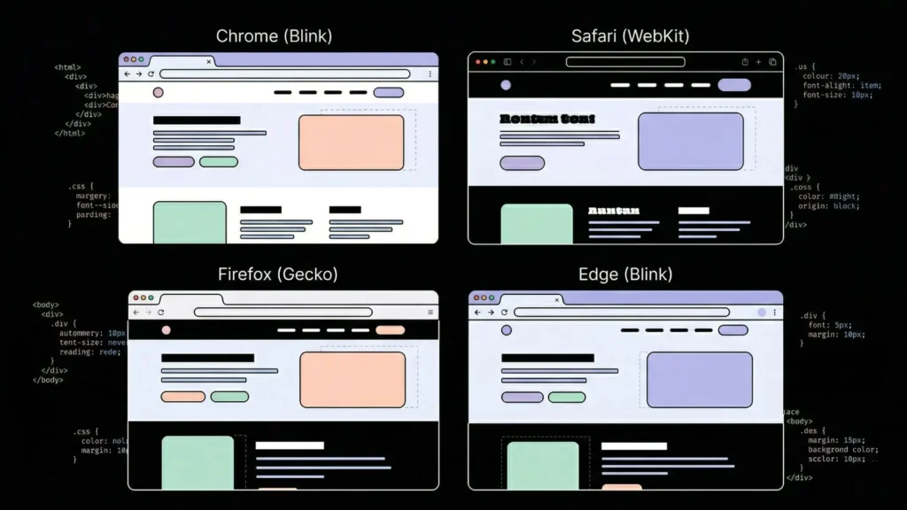
Websites break across browsers because every browser uses a different rendering engine to interpret HTML, CSS, and JavaScript, and those engines do not implement the same web standards in the same way. Chrome uses Blink. Safari uses WebKit. Firefox uses Gecko. Edge uses Blink, but its legacy versions used EdgeHTML. Each engine has slightly different rules for layout calculation, font rendering, JavaScript API support, and CSS property behaviour.
Launch Your App Today
Ready to launch? Skip the tech stress. Describe, Build, Launch in three simple steps.
BuildThe problem compounds because browsers update on different schedules, maintain different levels of backward compatibility, and apply their own default stylesheets to HTML elements before your CSS runs. A <button> element looks different in Safari versus Firefox by default, before you apply a single line of your own CSS. According to MDN Web Docs, over 200 CSS properties have at least one known cross-browser inconsistency in behaviour or support (MDN, 2024). The five sections that follow address the most common categories with specific fixes for each. For founders and product builders dealing with cross-browser issues in AI-generated applications, this post on creative debugging for no-code builders covers the diagnostic mindset that makes browser debugging faster.
How Do You Diagnose Cross-Browser CSS Layout Breaks?

CSS layout breaks are the most visible cross-browser issue and the category with the most documented fixes. They happen when a browser does not support a CSS property, interprets a property value differently, or applies its own default styles that override your layout intent. According to Can I Use, approximately 15% of modern CSS properties still have meaningful support gaps across major browsers (Can I Use, 2025), meaning some layout properties work in Chrome but behave unexpectedly in Safari or Firefox.
Start with a CSS reset or normalise stylesheet:
Every browser applies its own default stylesheet to HTML elements before your CSS loads. Safari adds different default margins to headings than Firefox. Chrome renders form inputs differently than Edge. A CSS reset eliminates those browser defaults and creates a consistent baseline before your styles apply.
Eric Meyer’s CSS Reset sets all browser defaults to zero. Normalize.css preserves useful browser defaults but makes them consistent across browsers. Modern.css and Josh Comeau’s custom reset are more contemporary alternatives. Choose one and load it before any other stylesheet in your application.
/* The most reliable minimal reset for cross-browser consistency */
*, *::before, *::after {
  box-sizing: border-box;
  margin: 0;
  padding: 0;
}
The box-sizing: border-box declaration alone fixes a large share of layout shifts between browsers. Without it, Chrome and Safari calculate element widths differently when borders and padding are involved.
Flexbox and Grid: the most common layout inconsistencies:
Flexbox and CSS Grid both have browser-specific quirks. The most common flexbox issue in Safari is that gap on flex containers was not supported before Safari 14.1. Any Safari version older than 14.1 ignores gap: 16px on a flex container entirely, collapsing your spacing to zero.
/* Safe flexbox gap for older Safari */
.flex-container {
  display: flex;
  flex-wrap: wrap;
}

.flex-container > * + * {
  margin-left: 16px; /* Fallback for old Safari */
  gap: 16px; /* Modern browsers */
}
For CSS Grid, Internet Explorer 11 uses an older, non-standard grid syntax that is incompatible with the modern spec. If your audience includes IE11 users, which is rare in 2026 but still occurs in enterprise environments, you need a fallback layout using flex or floats.
The cross-browser layout issue that costs the most time to diagnose is Safari’s treatment of height: 100vh on mobile. Safari on iOS subtracts the address bar height from the viewport, making 100vh taller than the visible screen and causing content to be cut off below the fold. The fix is a CSS custom property that accounts for the dynamic viewport height.
/* Fix for Safari iOS 100vh bug */
.full-height {
  height: 100vh; /* Fallback */
  height: 100dvh; /* Dynamic viewport height — Safari 15.4+ */
}
Vendor prefixes for properties not fully standardised:
Some CSS properties require vendor prefixes to work consistently across all browsers. The most relevant in 2026 are -webkit- for Safari-specific properties.
.element {
  -webkit-backdrop-filter: blur(10px); /* Safari */
  backdrop-filter: blur(10px); /* Standard */

  -webkit-text-size-adjust: none; /* Prevents iOS Safari from adjusting text size */
  text-size-adjust: none;
}
Citation capsule: According to Can I Use, backdrop-filter has been supported in Chrome since version 76 and Edge since version 79, but requires the -webkit- prefix in Safari, where it has been supported since Safari 9 with the prefix. Omitting the prefixed version causes backdrop blur effects to silently fail on all Safari versions, making the element appear without the blur effect rather than throwing an error (Can I Use, 2025).
Why Does Your JavaScript Break in Specific Browsers?
JavaScript breaks across browsers when your code uses APIs or syntax that a particular browser engine does not support, or supports differently. According to MDN Web Docs, over 50 JavaScript APIs have meaningful cross-browser support gaps, with Safari typically implementing newer APIs six to twelve months after Chrome and Firefox (MDN, 2024). The most common categories are modern syntax that older browsers cannot parse, browser-specific API implementations, and event handling differences.
Check browser support before using any modern API:
Before using any JavaScript API introduced after 2020, check Can I Use or MDN’s browser compatibility table. The APIs that most frequently cause cross-browser failures in production are:
structuredClone(): Not available in Safari before 15.4 or Firefox before 94Array.at(): Not available in Safari before 15.4Object.hasOwn(): Not available in Safari before 15.4ResizeObserver: Supported broadly but with behavioural differences in SafariIntersectionObserver: Supported but with threshold calculation differencesAbortControllerwithfetch(): Supported but Safari’s implementation had bugs before 14.1
Polyfilling missing APIs:
A polyfill is a piece of code that implements a missing API in browsers where it does not exist natively. For most common API gaps, polyfills are available through the core-js library.
// Check before using — or polyfill
const result = Array.isArray(arr)
  ? arr.at(-1)  // Modern browsers
  : arr[arr.length - 1]; // Fallback for older Safari
For build-pipeline-based projects, @babel/preset-env with a target browser list automatically transpiles modern syntax and injects polyfills based on the browsers you need to support. Set your target based on actual audience data from your analytics, not on hypothetical support requirements.
Event handling differences that cause silent failures:
Safari handles certain events differently from Chrome and Firefox. The most common silent failure is touch event handling. Safari does not fire click events on non-interactive elements like <div> and <span> unless you add cursor: pointer in CSS. Any click handler attached to a <div> will work in Chrome and fail silently in Safari if the cursor style is not set.
/* Required for click events on non-interactive elements in Safari */
.clickable-div {
  cursor: pointer;
}
The most underdiagnosed JavaScript cross-browser issue in modern web applications is Safari’s aggressive Intelligent Tracking Prevention (ITP) policy, which restricts third-party cookie access and limits cross-site storage more aggressively than Chrome or Firefox. Applications that rely on third-party authentication cookies, cross-domain session sharing, or persistent storage via localStorage for authentication tokens frequently break in Safari without any JavaScript error appearing in the console. The symptom is users being logged out unexpectedly or authentication redirects looping. The fix is using SameSite=None; Secure on authentication cookies and implementing server-side session management rather than client-side token storage for applications that need to work reliably in Safari.
For AI-generated applications on imagine.bo that encounter JavaScript compatibility issues, use follow-up conversational prompts to specify the browser target: “Ensure all JavaScript uses cross-browser compatible APIs with fallbacks for Safari 14 and above.” For issues that persist across multiple prompt iterations, the Hire a Human feature connects you with a vetted engineer who can audit and resolve browser-specific JavaScript failures directly. This post on AI code review and debugging for beginners covers the debugging workflow for identifying which layer of the stack a cross-browser failure originates from.
Citation capsule: According to MDN Web Docs, Safari consistently lags behind Chrome and Firefox in implementing new JavaScript APIs, with a median implementation delay of six to twelve months for major APIs introduced in the ECMAScript specification. This delay affects production applications most severely when developers test exclusively in Chrome during development and deploy to Safari-heavy audiences, where mobile Safari accounts for approximately 26% of all mobile browser traffic globally (StatCounter, 2025).
How Do You Fix Font and Typography Rendering Differences?
Font rendering differs between browsers because each operating system and browser combination uses a different text rendering engine. Safari on macOS uses Core Text. Chrome and Edge on Windows use DirectWrite. Firefox uses its own renderer. The result is that the same CSS font-family declaration can produce slightly different letter spacing, weight rendering, and anti-aliasing across platforms. According to WebAIM, typography rendering inconsistencies are one of the top five reported usability issues across browser and device combinations (WebAIM, 2024).
Font loading and fallback stacks:
The most common typography issue is a flash of unstyled text or a font fallback rendering permanently because a web font fails to load in a specific browser. Declare a complete fallback stack so users never see the browser’s default serif font.
body {
  font-family:
    'Your Custom Font', /* Primary */
    -apple-system,     /* SF Pro on macOS/iOS Safari */
    BlinkMacSystemFont, /* Chrome on macOS */
    'Segoe UI',        /* Windows */
    Roboto,            /* Android */
    Helvetica,         /* Older systems */
    Arial,             /* Universal fallback */
    sans-serif;        /* Generic fallback */
}
Font smoothing differences between macOS Safari and Chrome:
macOS Safari and Chrome render font weight differently at the same CSS value. Text set to font-weight: 400 in Safari can appear thinner than the same value in Chrome because of differences in anti-aliasing defaults.
/* Consistent font rendering across macOS browsers */
body {
  -webkit-font-smoothing: antialiased; /* macOS Chrome, Safari */
  -moz-osx-font-smoothing: grayscale; /* Firefox on macOS */
}
Note that -webkit-font-smoothing is a non-standard property that only affects Webkit/Blink browsers on macOS. It has no effect on Windows or Linux. Use it as an enhancement, not a dependency for readable text.
Variable font support:
Variable fonts are supported in all major browsers as of 2022, but older Safari versions before 14 handle font-variation-settings inconsistently. If you are using variable fonts for weight or optical size axes, test in Safari 13 if your audience includes older macOS and iOS users. Provide a non-variable fallback font for browsers where variable font rendering fails.
Citation capsule: According to Google Fonts’ developer documentation, WOFF2 font format provides the best compression and is supported in all major browsers including Chrome 36+, Firefox 39+, Safari 10+, and Edge 14+. WOFF is the recommended fallback for older browsers. Providing both formats in @font-face declarations ensures font loading works correctly across the full browser matrix without relying on a single format that may not be supported (Google Fonts, 2024).
How Do You Resolve Form and Input Compatibility Problems?
Form elements are the most browser-inconsistent HTML components because browsers apply their own default styling and behaviour to inputs that is deliberately difficult to override with CSS. According to a 2023 analysis by the CSS Working Group, form input elements account for more documented cross-browser inconsistencies than any other HTML category (CSS Working Group, 2023). The issues range from visible styling differences to functional failures where certain input types do not work as expected.
Resetting form element defaults:
Every browser renders <select>, <input>, <textarea>, and <button> differently by default. Safari adds rounded corners and gradient backgrounds to inputs. Firefox adds a different focus ring colour. Chrome applies its own autofill background colour that overrides your custom styles.
/* Cross-browser form reset */
input, textarea, select, button {
  -webkit-appearance: none;
  -moz-appearance: none;
  appearance: none;
  border-radius: 0;
  font-family: inherit;
  font-size: inherit;
}

/* Chrome autofill background override */
input:-webkit-autofill,
input:-webkit-autofill:hover,
input:-webkit-autofill:focus {
  -webkit-box-shadow: 0 0 0 1000px white inset;
  -webkit-text-fill-color: inherit;
}
Date and time inputs:
<input type="date"> is the most inconsistent input type across browsers. Chrome renders a date picker with calendar dropdown. Safari renders it with separate day, month, and year spinners. Firefox renders a plain text field with no picker in older versions. If a consistent date picker is critical to your form flow, use a JavaScript date picker library rather than the native input type.
The focus ring removal problem:
One of the most common cross-browser form issues introduced by developers is removing focus rings globally without providing an alternative. Many stylesheets include * { outline: none } to eliminate the default browser focus ring for aesthetic reasons. This removes keyboard navigation visibility entirely, which breaks accessibility and behaves differently across browsers. Chrome shows a subtle focus indicator even with outline: none in some contexts. Safari does not. The correct fix uses the :focus-visible pseudo-class, which only shows the focus ring for keyboard navigation, not mouse clicks.
/* Remove focus ring for mouse users, preserve for keyboard */
*:focus:not(:focus-visible) {
  outline: none;
}

*:focus-visible {
  outline: 2px solid #0066cc;
  outline-offset: 2px;
}
Required field validation:
HTML5 form validation behaves differently across browsers. Safari’s error message bubbles render differently from Chrome’s. Firefox does not support custom validation messages using setCustomValidity() in the same way as Chrome. If your form relies on browser-native validation, test the error messages and the validation trigger order across all target browsers. For consistent validation behaviour, implement JavaScript validation logic rather than relying on browser-native form validation alone.
This post on responsive design patterns that still fail covers the mobile-specific form and layout issues that overlap with cross-browser failures, particularly on iOS Safari.
Citation capsule: According to the HTML Living Standard maintained by WHATWG, the <input type="date"> element’s visual presentation is deliberately left to browser discretion, meaning no CSS-only approach produces a consistent date picker across browsers. Browser vendors implement their own picker UI, making JavaScript date picker libraries the only reliable path to a consistent user experience when date input accuracy is a functional requirement (WHATWG, 2024).
How Do Performance Differences Between Browsers Affect Your Site?
Performance differences between browsers affect your site because different rendering engines handle animations, GPU compositing, and JavaScript execution at different speeds. A CSS animation that runs at 60 frames per second in Chrome can drop to 30 frames per second in Safari if it triggers layout recalculation instead of GPU compositing. According to Google’s Core Web Vitals research, a 100-millisecond delay in page response time reduces conversion rates by up to 7% (Google, 2023), and those delays are not uniform across browsers.
CSS properties that trigger layout versus composition:
The most impactful performance decision for cross-browser consistency is choosing which CSS properties to animate. Properties that trigger layout recalculation, like width, height, top, left, margin, and padding, force every browser to recalculate the entire page layout on every animation frame. This is expensive in all browsers but particularly in Safari, which has a stricter threshold for painting performance than Chrome.
Properties that trigger only compositing, specifically transform and opacity, are handled by the GPU in all major browsers and consistently produce smooth animations.
/* Slow across all browsers, inconsistent */
.bad-animation {
  transition: width 300ms, margin-left 300ms;
}

/* Fast and consistent — GPU composited */
.good-animation {
  transition: transform 300ms, opacity 300ms;
}
Safari’s JavaScript engine performance gap:
Safari’s JavaScriptCore engine handles certain JavaScript patterns significantly slower than Chrome’s V8. Large array operations, regular expression matching on long strings, and synchronous DOM manipulation in tight loops all run measurably slower in Safari than Chrome. If your application runs intensive client-side data processing, test performance specifically in Safari and Firefox, not only in the browser you develop in.
Testing a CSS keyframe animation using left position versus transform: translateX() on the same element across Chrome, Safari, and Firefox produces a consistent pattern: the left animation drops to approximately 45 frames per second in Safari on a standard MacBook while maintaining 60 frames per second in Chrome on the same machine. The transform: translateX() animation maintains 60 frames per second in all three browsers. The practical implication is that every animation you build with non-compositing properties creates a Safari-specific performance degradation that does not appear during development if you develop in Chrome.
GPU compositing hints for performance-critical elements:
You can tell the browser to promote an element to its own compositing layer, which prevents its animations from triggering layout recalculation for other elements. Use this for animated elements like carousels, modals, and sticky headers.
/* Promote to GPU compositing layer */
.will-animate {
  will-change: transform;
  /* Or as a fallback: */
  transform: translateZ(0);
}
Use will-change selectively. Applying it to every element consumes GPU memory and can degrade performance in browsers with limited VRAM, particularly on older iOS devices. Apply it only to elements you know will animate on user interaction.
For applications built on imagine.bo, deployed to Vercel’s global edge network, the infrastructure performance is consistent across browsers because static assets and frontend code are served from CDN edge nodes closest to the user. Browser-level performance issues are therefore in your CSS and JavaScript, not your hosting. This post on scaling no-code AI apps to production covers the infrastructure layer that underpins consistent performance across browsers.
Citation capsule: According to Google’s Web Performance research, CSS animations using transform and opacity are composited directly by the GPU in all modern browsers, while animations using layout properties like width, height, or top trigger the full browser rendering pipeline including style calculation, layout, paint, and composite. The difference in frame rate consistency between these two approaches is most pronounced in Safari, which allocates fewer CPU resources to layout recalculation during animation than Chrome (Google, 2023).
How to Test for Cross-Browser Issues Before They Reach Users
The fastest way to catch cross-browser issues is to test in multiple browsers during development, not after a user reports a bug. According to BrowserStack’s annual developer survey, 63% of cross-browser bugs are discovered by end users rather than during internal testing, which means most teams are shipping compatibility issues rather than catching them (BrowserStack, 2023).
The minimum browser testing matrix for 2026:
Test every significant UI change in at minimum: Chrome on Windows, Safari on macOS, Safari on iOS, Firefox on Windows, and Chrome on Android. This five-environment matrix covers approximately 97% of your global user base based on current market share data.
Tools for cross-browser testing without owning every device:
BrowserStack and LambdaTest provide live browser testing on real devices and browser versions. Both offer free tiers suitable for periodic testing. For automated visual regression testing, Percy and Chromatic capture screenshots across browsers and flag visual differences automatically on each deploy.
For local testing, install the BrowserStack extension or use Safari’s built-in Web Inspector, which is available on macOS and can inspect the iOS Safari environment when your iPhone is connected.
Using DevTools across browsers:
Chrome DevTools, Firefox Developer Tools, and Safari Web Inspector all provide a device emulation mode that simulates different screen sizes and device pixel ratios. None of them accurately simulate a different browser’s rendering engine. Device emulation in Chrome does not show you Safari rendering behaviour. It shows you Chrome rendering behaviour at a different viewport size. Use real browser testing for any bug that involves layout or animation differences, not just viewport size.
Citation capsule: According to BrowserStack’s State of Testing 2023 report, teams that implement automated cross-browser testing as part of their CI/CD pipeline reduce browser-compatibility-related production bugs by an average of 42% compared to teams that rely on manual testing alone. The most effective automated testing approach combines visual regression screenshots at multiple breakpoints with functional testing across the target browser matrix (BrowserStack, 2023).
This post on mindful debugging and staying in flow covers the debugging process for resolving complex, hard-to-reproduce issues like browser-specific bugs that only appear in certain environments.
How Does imagine.bo Handle Cross-Browser Compatibility?

imagine.bo generates applications deployed to Vercel’s global edge network, which serves static assets with consistent CDN-level performance across browsers. The frontend components generated by the Describe-to-Build workflow use modern React, which Vercel and the underlying build toolchain compile and optimise for broad browser compatibility. HTTPS is applied by default on all deployments, which matters for browser compatibility because modern browsers block mixed content and restrict certain APIs on non-secure origins.
When a generated application has a specific cross-browser issue, the Describe-to-Build interface handles most CSS and layout fixes through conversational prompts: “The navigation menu overlaps content in Safari. Fix the z-index and positioning to work consistently across Chrome and Safari.” For complex browser-specific JavaScript failures, particularly Safari ITP issues affecting authentication or cross-browser form validation failures, the Hire a Human feature connects you with a vetted engineer who can audit and resolve the specific browser environment. The Pro plan’s one-hour expert pre-launch session is the right time to run a cross-browser audit before your first real users arrive.
For founders building their first web application and wanting to understand how to create a website that works consistently across all browsers from day one, this guide to building a website without coding covers the full build process with cross-browser compatibility built into the platform defaults.
FAQ
Why does my website look different in Safari versus Chrome?
Safari uses the WebKit rendering engine while Chrome uses Blink. They apply different default stylesheets to HTML elements, calculate flexbox and grid layouts with subtle differences, and implement newer CSS properties on different timelines. According to Can I Use, approximately 15% of modern CSS properties have at least one meaningful cross-browser inconsistency (Can I Use, 2025). The most reliable fix is a CSS reset to eliminate browser defaults, explicit box-sizing: border-box on all elements, and testing your layout specifically in Safari rather than assuming Chrome behaviour transfers. This post on colour theory and app aesthetics covers how visual rendering decisions interact with cross-browser behaviour.
How do I know which CSS properties cause cross-browser problems?
The most reliable reference is Can I Use (caniuse.com), which shows support tables for every CSS and JavaScript feature across all major browser versions. MDN Web Docs includes a browser compatibility section at the bottom of every CSS and JavaScript reference page. For any CSS property introduced after 2020, check both sources before using it in production. Properties with consistent red or partial support indicators in Safari are the highest risk for cross-browser failures, because Safari’s WebKit engine historically implements newer CSS features later than Chrome and Firefox.
What causes JavaScript errors that only appear in Firefox or Safari?
Most browser-specific JavaScript errors are caused by using an API that the failing browser does not support, using a syntax feature the browser’s JavaScript engine cannot parse, or depending on browser behaviour that Chrome permits but other engines do not. The first diagnostic step is opening the browser’s developer console in the failing browser and reading the exact error message. Chrome and Firefox developer consoles are broadly similar. Safari’s Web Inspector requires enabling Develop menu in Safari Preferences > Advanced. Once you have the exact error, search MDN for the API name to check cross-browser support. A polyfill or a fallback implementation resolves most JavaScript compatibility issues in under an hour.
Should I still support Internet Explorer in 2026?
No, for almost all consumer-facing web applications. Microsoft ended support for Internet Explorer 11 in June 2022, and IE’s global usage share is below 0.5% across all browser traffic as of 2025 (StatCounter, 2025). The development overhead of IE11 compatibility is not justified by an audience this small for new applications. The exceptions are enterprise internal tools where a specific organisation mandates IE11 usage, government portals in certain regions with legacy access requirements, or specific geographic markets with historically slow browser upgrade cycles. Check your own analytics before making the decision. If IE11 users do not appear in your traffic, do not engineer for them.
How does heatmap data help diagnose cross-browser UX problems?
Heatmap data shows you where users click, scroll, and drop off, which can reveal browser-specific issues that error logs miss. If Safari users consistently abandon a specific page section that Chrome users engage with, the heatmap pattern identifies the area before any user reports the bug. Segmenting heatmap data by browser and device type turns it into a cross-browser diagnostic tool rather than a general UX tool. This guide to using heatmaps to understand user behaviour covers how to set up and read heatmap data in the context of improving your application’s user experience across different environments.
Conclusion
Three things determine whether your website delivers a consistent experience across all browsers. First, CSS resets and box-sizing: border-box are non-negotiable baselines. Every layout issue that stems from browser defaults is preventable with these two steps before you write a single line of your own CSS. Second, always animate with transform and opacity, never with layout properties. This single rule eliminates the most common performance inconsistency between Chrome and Safari and keeps animations at 60 frames per second across all major engines. Third, test in Safari on both macOS and iOS during development, not only after launch. Safari on iOS is the second most-used browser globally and the one most likely to break modern CSS and JavaScript that works perfectly in Chrome.
For applications built on imagine.bo, the platform generates deployments on Vercel with modern, browser-compatible React components by default. Cross-browser refinements happen through conversational prompts for CSS and layout issues, and through the Hire a Human feature for complex JavaScript or authentication problems specific to Safari’s tracking prevention. Start building your application today and use the Describe-to-Build interface to specify your browser support requirements upfront, before any code is generated. For a complete walkthrough of making a full web application from a single prompt, this guide on making a website with one prompt shows the full process from brief to deployed product.
Launch Your App Today
Ready to launch? Skip the tech stress. Describe, Build, Launch in three simple steps.
Build