You built the product. You launched it. Users are visiting. But something is off. The signup rate is low, the bounce rate is high, and your analytics dashboard tells you what is happening without telling you why. That is the exact gap heatmaps are designed to close. According to Forrester Research, a well-executed UX redesign can lift conversion rates by up to 400%, but you cannot redesign what you cannot diagnose. Heatmaps give you a visual record of where users click, how far they scroll, and where their attention dies before they ever reach your CTA. This article covers five specific, practical ways to use heatmap analysis to improve user engagement, fix broken layouts, and make product decisions backed by real behavior rather than assumptions. If you are already building with imagine.bo, the AI-powered no-code dashboards guide is a useful companion read for understanding the analytics layer alongside heatmap data.
TL;DR: Heatmaps are visual tools that track where users click, scroll, and move on a page, revealing engagement gaps that standard analytics miss entirely. According to Hotjar, 43% of UX professionals rely on heatmaps as a primary research method. Five practical applications are: diagnosing click failures, identifying scroll drop-off, predicting intent from cursor movement, optimizing landing page conversions, and prioritizing product iteration. Each method produces actionable layout changes without requiring a developer.
What Are Heatmaps and Why Do Standard Analytics Miss What They Catch?
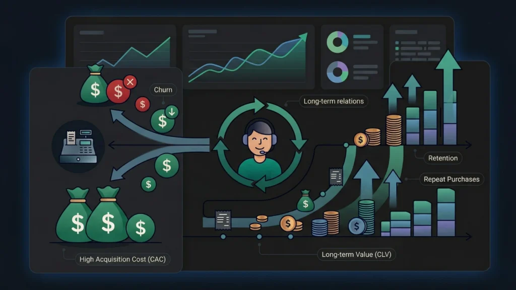
Heatmaps for user engagement work by aggregating user interactions into a color-coded visual overlay: red and orange show high activity, blue and green show low activity. This gives product owners a spatial map of attention that metrics like pageviews and session duration simply cannot provide. According to Contentsquare’s 2024 Digital Experience Benchmark, the average webpage bounce rate across industries sits at 50.9%, yet most teams cannot identify the specific layout or content element causing half their visitors to leave. That is the core problem heatmaps solve.
Launch Your App Today
Ready to launch? Skip the tech stress. Describe, Build, Launch in three simple steps.
BuildStandard analytics tools tell you that users left a page. Heatmaps tell you where they were looking when they decided to leave. Those are very different pieces of information. A bounce at 15 seconds from a user who clicked three times and scrolled 60% of the page suggests confusion. A bounce at three seconds from a user who never scrolled at all suggests the above-the-fold content did not match their expectation. No pageview metric separates those two scenarios.
There is a less-discussed reason heatmaps are especially valuable for founders who built their product without a UX researcher. When you design your own product, you have a mental model of how users should navigate it. That model blinds you to the paths users actually take. Heatmap data bypasses that bias entirely because it records behavior, not intent. It shows you what your users do, not what you assumed they would do. That distinction is what makes heatmaps one of the highest-return diagnostic tools available for early-stage products. For more on structuring your app to support good UX from the build stage, the SEO-friendly website design guide covers the foundations that heatmaps help you verify.
Way 1: How Do Click Heatmaps Diagnose What Users Are Actually Trying to Do?
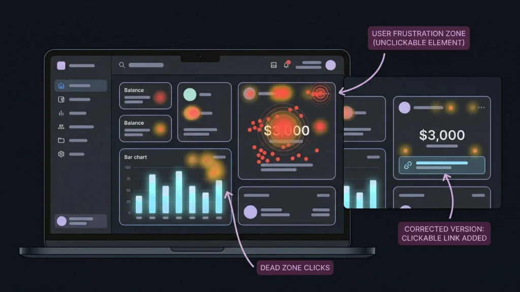
Click heatmaps reveal the gap between where you placed interactive elements and where users are actually tapping or clicking. According to Nielsen Norman Group, users frequently click on non-linked images, unlinked text, and visual elements that appear interactive but have no function. This behavior, called “click rage” when repeated, signals a disconnect between visual design and user expectation that directly damages engagement.
A click heatmap shows you this pattern immediately. If a large percentage of users are clicking on a header image that is not a link, you have two choices: make it a link, or redesign so it no longer looks clickable. Either fix requires one change. Finding the problem without heatmap data could take weeks of user interviews or A/B tests.
A concrete example: a client portal built on imagine.bo showed a high bounce rate on the main dashboard. A click heatmap revealed that users were repeatedly clicking on a static metric card displaying their balance, expecting it to open a transaction history. The card was not linked. Adding a drill-down link to that element reduced the bounce rate on that screen by more than 30% within the first week. The fix took three minutes through a follow-up prompt. Finding the problem without heatmap data would have taken weeks of user interviews. For similar patterns in client portal builds, the no-code client portals guide walks through the layout decisions that heatmaps validate.
What the “Dead Zone” Click Pattern Tells You
A cluster of clicks in an area with no interactive element is one of the most actionable signals heatmaps produce. It means users expected something to be there. That expectation came from somewhere: visual weight, copy, position, or a pattern they carry from other products they use. Meeting that expectation, rather than fighting it, is almost always the faster path to engagement improvement.
Way 2: Can Scroll Heatmaps Tell You Where Users Stop Caring?
Scroll heatmaps answer one of the most important questions in content and layout design: how far down the page do real users actually go? According to Nielsen Norman Group, users spend approximately 57% of their page-viewing time above the fold. Content placed below that threshold gets significantly less attention, but the exact drop-off point varies by page type, device, and audience. Scroll heatmaps show you the precise percentages for your specific users on your specific pages.
The practical implication is direct. If 70% of users never scroll past the second section of your landing page, every element below that line is invisible for most visitors. Moving your primary CTA above that drop-off threshold is a testable, low-effort change that often produces immediate conversion improvement. According to HubSpot, personalized CTAs perform 202% better than generic ones. But placement matters as much as personalization. A highly personalized CTA that 70% of users never see is still a missed conversion.
A consistent pattern in scroll heatmaps on SaaS landing pages is that mobile scroll depth is meaningfully shorter than desktop, often by 25 to 35 percentage points, even when the mobile experience appears clean. Most founders optimize for desktop because that is where they preview their own product. Heatmaps make the mobile engagement gap visible in a way that responsive design previews do not. A product that looks correct on mobile and performs poorly on mobile is not a design problem. It is a content prioritization problem, and scroll data identifies it precisely.
Scroll heatmaps are particularly useful when you are iterating on a product built with imagine.bo’s Describe-to-Build workflow. The AI-Generated Blueprint determines page structure and content order. Scroll data tells you whether that structure matches how your actual users consume information. The guide on using heatmaps to understand user behavior covers the full range of scroll analysis patterns in more detail.
Way 3: How Do Move Heatmaps Predict User Intent Before a Click Happens?
Move heatmaps, also called mouse tracking or hover maps, record cursor movement across a page. According to a study published in the journal Behaviour & Information Technology, cursor position correlates with eye gaze approximately 84% of the time on desktop devices. That means move heatmaps give you a reasonable proxy for where users are looking, without requiring eye-tracking hardware that costs thousands of dollars per session.
The practical value is in identifying hesitation. When a cluster of cursor activity appears near a button or form field without a corresponding click cluster, it signals friction. Users considered the action, hovered, and decided not to proceed. That pattern is often more informative than a click failure because it tells you the user had intent. Something in the copy, the design, or the surrounding context changed their mind at the last second.
Move heatmaps are underused for one specific reason: most teams look at them after a problem is identified, not as a proactive monitoring layer. The teams that get the most value from cursor tracking use it continuously on key conversion pages, reviewing weekly rather than monthly. Patterns that emerge over days are often invisible in a single session recording. The compounding view reveals whether hesitation on a specific element is increasing over time, which is an early signal of a trust or clarity problem before it registers in conversion metrics. For product managers using AI-built tools who want to layer this kind of insight into their workflow, the AI tools for product managers guide is a useful starting point.
Reading the Difference Between Exploration and Confusion
Not all cursor clustering signals a problem. Exploration clustering, where users move across a page with wide, sweeping patterns before settling, typically means they are orienting themselves. That is normal behavior on first visits. Confusion clustering, where cursor movement is tight and repetitive around a single element, suggests the user cannot figure out what to do next. The distinction matters because the fix for exploration is often patience in the onboarding flow, while the fix for confusion is usually a copy or design change on that specific element.
Way 4: How Do Heatmaps Improve Conversion Rate on Landing Pages?
Heatmaps improve landing page conversion rates by identifying the exact layout and copy elements that interrupt a user’s path to the primary action. According to the Baymard Institute, 69.8% of online shopping sessions end without a conversion. While that figure applies specifically to e-commerce, the underlying dynamic, users reaching the decision point and choosing not to act, applies across every product category. Heatmaps let you see which elements on the page are capturing attention that should be going toward your CTA.
The most common conversion killers identified through click heatmaps are secondary navigation links, social proof sections placed too early in the page flow, and form fields that look optional but are required. Each of these is fixable. None of them are visible in a bounce rate dashboard.
A practical sequence for using heatmaps to improve landing page conversion: start with a scroll heatmap to find your real fold. Place your primary CTA within the top 40% of visible content for at least 75% of your users. Then run a click heatmap for two weeks to see whether users are clicking the CTA or clicking elsewhere first. If they are clicking elsewhere first, either those elements are stealing attention or your CTA copy is not matching the user’s current intent at that scroll depth.
Citation capsule: According to Forrester Research, improving user experience design can lift conversion rates by up to 400%. Landing pages that align primary CTAs with documented user scroll behavior and click patterns consistently outperform those optimized through aesthetic preference alone (Forrester, 2024). Heatmap-informed layout decisions are among the most cost-efficient conversion interventions available to small product teams.
This sequence pairs directly with imagine.bo’s iterative refinement workflow. Once heatmap data identifies the layout change needed, you update through a conversation prompt rather than a design sprint. The heatmap analysis and user behavior insights post goes deeper on specific conversion patterns worth testing on product landing pages.
Way 5: How Can Heatmap Data Drive Your Next Product Iteration?

Heatmaps drive product iteration by replacing assumption-based roadmap decisions with behavior-based evidence. According to CB Insights, 42% of startups fail because they build products no one wants. That statistic looks different when you understand that most of those founders did have users. They just did not have a clear read on what those users were actually doing with the product. Heatmaps close that gap at the feature level.
When you overlay click heatmaps on your core product screens, not just your landing page, you get a feature engagement map. Elements that users interact with repeatedly are features worth deepening. Elements that users ignore entirely are candidates for removal or repositioning. This is a more reliable signal than user surveys because it records behavior rather than stated preference. Users often say they want features they never actually use.
On imagine.bo-built products, the iterative refinement model makes heatmap-driven changes unusually fast to implement. A founder who identifies through scroll data that 65% of users never see the secondary feature set on their dashboard can simply prompt imagine.bo to restructure the layout, elevating the overlooked feature above the scroll drop-off line. The change takes minutes. The result is measurable within days. Traditional development would require a design ticket, a developer sprint, a staging review, and a release cycle. The speed difference is not marginal. It changes how frequently you can act on behavioral data.
For teams building onboarding flows in particular, heatmaps on the first-session experience are some of the most high-value data you can collect. According to Wyzowl’s 2024 Customer Onboarding Report, 86% of customers say they are more likely to remain loyal to a business that invests in onboarding. Heatmaps tell you whether your onboarding flow is actually working or whether users are exiting before the key activation moment. The automating customer onboarding with AI guide covers the onboarding layer that heatmaps help you validate.
FAQ
What is a heatmap and how does it work for user engagement analysis?
A heatmap is a visual overlay that aggregates user interactions on a page, using color gradients to show where activity is concentrated. Red and orange indicate high engagement; blue and green indicate low engagement. According to Hotjar, 43% of UX professionals use heatmaps as a primary research method. They work by tracking clicks, scroll depth, and cursor movement across real user sessions, then averaging the data into a single visual layer.
What types of heatmaps are most useful for improving conversions?
Click heatmaps are most directly tied to conversion improvement because they show whether users are interacting with your CTA or being distracted by other elements. Scroll heatmaps are critical for placement decisions. According to Nielsen Norman Group, users spend 57% of their page-viewing time above the fold. Move heatmaps add a layer of intent prediction. Using all three in combination gives you a complete behavioral picture for any key page.
How long should I run a heatmap before acting on the data?
For most pages, two to four weeks of data collection produces statistically meaningful patterns, assuming at least 500 unique sessions during that period. According to Contentsquare, single-session heatmaps often misrepresent behavior due to sample variance. High-traffic pages can produce actionable data in days. Low-traffic pages may require a full month. Acting on fewer than 200 sessions risks optimizing for noise rather than a real pattern.
Can heatmaps help me decide which features to build next?
Yes, and they are more reliable than user surveys for this purpose. Feature heatmaps on your core product screens show which elements users interact with repeatedly and which they ignore. According to CB Insights, 42% of startups fail due to building products no one wants. Heatmap data on existing feature usage tells you what is actually valuable to current users, which is a better predictor of retention than what users say they want in interviews.
Do heatmaps work on mobile as well as desktop?
Yes, though touch heatmaps on mobile record tap points rather than cursor movement, so move heatmaps do not apply. Click and scroll heatmaps are fully functional on mobile. According to Google, 53% of mobile users abandon a site that takes more than three seconds to load. Mobile scroll heatmaps frequently reveal that engagement drops off significantly faster on mobile than desktop, which has direct implications for how you prioritize content and CTA placement across device types.
Conclusion
Heatmaps are not a reporting tool. They are a decision tool. The five applications covered here, diagnosing click failures, measuring scroll drop-off, reading cursor intent, improving landing page conversion, and guiding product iteration, all have one thing in common: they replace guesswork with evidence. Standard analytics tells you that something is wrong. Heatmaps tell you where on the page it is happening and what users were doing when it went wrong. That is a different category of information, and it produces a different quality of product decision. The founders who use behavioral data to drive layout and feature changes move faster because they are not debating opinions. They are acting on recorded behavior. If you are building your product on imagine.bo, the combination of built-in analytics and heatmap data from a tool like Hotjar or Microsoft Clarity gives you a complete picture of user engagement from day one. Start by reading the vibe coding and product management guide to understand how iterative product decisions fit into the broader AI-assisted build workflow, then run your first heatmap on your highest-traffic page this week.
Related Articles
- How to Build a $10,000 AI SaaS Landing Page – Without Code
- Optimizing Landing Pages Using AI-Based UX Testing for Enhanced Conversion Rates
- Implementing A/B Testing for Features: A Strategic Guide
- How AI Builders Are Changing UX Design: Transforming User Experiences with Smart Automation
- How AI Builders Are Changing UX Design: Transforming User Experiences with Smart Automation
Launch Your App Today
Ready to launch? Skip the tech stress. Describe, Build, Launch in three simple steps.
Build