
Most founders pick colors the way they pick fonts: by feel, or by copying something they saw recently. The result is apps that look inconsistent, feel off-brand, or worse, push users away before they’ve experienced the product. Color is not decoration. It is a functional system that controls attention, communicates meaning, and shapes how people feel about your product in the first two seconds.
This article breaks down the actual mechanics of color theory for app design: how color relationships work, what the psychology behind UI color choices means for your decisions, and how to build an app color palette that holds up across screens, states, and brand contexts. If you want a companion read on applying these principles at the component level, color theory to enhance app aesthetics covers the practical translation in more detail.
Launch Your App Today
Ready to launch? Skip the tech stress. Describe, Build, Launch in three simple steps.
BuildTL;DR: Color accounts for up to 90% of a user’s first impression of a product, according to research published in the journal Management Decision (Singh, 2006). A well-built app color palette uses one dominant brand color, one secondary accent, and a neutral system for backgrounds and text. The critical rule: contrast ratios for readable text must meet WCAG AA standards at a minimum of 4.5:1 for normal text. Get this wrong and you lose users to frustration before they ever reach your core feature.
Why Color Theory Matters More in Apps Than in Print
Color in app design does more functional work than in any other visual medium. Every color decision carries usability consequences. According to a 2023 study by the Nielsen Norman Group, users form a visual impression of an interface in approximately 50 milliseconds, and color is the primary driver of that impression (Nielsen Norman Group, 2023). That judgment is made before a single word is read.
Print design is static. App design is interactive. In an app, color must communicate state: which button is active, which field has an error, which item is selected, which action is destructive. Color handles all of that work simultaneously with brand and aesthetic goals. When those functions conflict, usability breaks.
Most color theory education focuses on aesthetics first. For app design, the correct mental model is to treat color as information architecture. Every color you assign is a signal to the user about what something is or what it does. Aesthetic appeal is a secondary layer on top of that functional foundation, not the starting point.
Good color decisions also reduce cognitive load. When your warning states are always amber, your success states are always green, and your primary actions are always your brand color, users stop thinking about the interface and start thinking about the task. That is the goal.
The Core Color Relationships Every App Designer Needs to Know
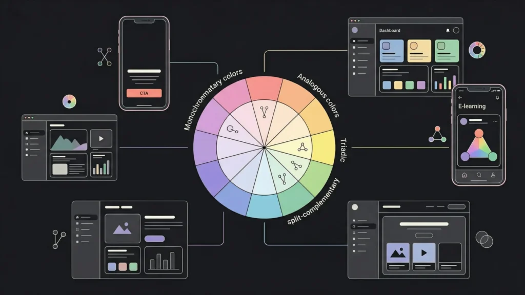
Understanding color relationships is the foundation of building a coherent app color palette. There are six primary schemes used in UI design, and each has a different emotional and functional profile. According to a 2024 analysis by the Interaction Design Foundation, complementary and analogous schemes account for over 65% of color palettes in top-rated apps on both iOS and Android (Interaction Design Foundation, 2024).
Complementary colors sit opposite each other on the color wheel, such as blue and orange or red and green. They create high contrast and visual tension. In app design, this tension is useful for calls to action where you want something to stand out sharply against a background. Use sparingly: too much complementary contrast creates visual fatigue.
Analogous colors sit adjacent on the color wheel: blue, blue-violet, and violet, for example. They feel harmonious and calm. Most enterprise SaaS products use analogous schemes for their primary UI palette because they are easy to look at for extended sessions. The weakness is low contrast between elements, so you’ll need to manage tonal variation carefully.
Triadic colors use three colors spaced equally around the color wheel. They are vibrant and visually dynamic. Consumer apps targeting younger demographics use triadic schemes frequently. The challenge is balance: without a clear dominant color, triadic palettes can feel chaotic.
Split-complementary schemes use one base color and the two colors adjacent to its complement. They give you the visual punch of complementary contrast with more room for harmony. This is arguably the most practical scheme for app design because it allows for one strong accent without the tension of pure complements.
Monochromatic schemes use one hue at different saturation and lightness levels. They are clean, professional, and technically easy to execute. Many modern minimalist apps, including productivity tools and fintech products, use monochromatic palettes because they signal seriousness and reduce distraction.
Choosing a scheme should start with the emotional register your product needs, not with a color you personally like. For more on how to build interfaces that hold up under these schemes, AI-assisted UI/UX design tools can accelerate the testing phase.
How to Build a Practical App Color Palette From Scratch
A functional app color palette has five distinct layers, and most founders short-circuit the process by only defining two or three of them. According to Material Design’s 2023 guidelines, a complete UI color system requires at minimum a primary color, a secondary color, a surface system, an error state, and an on-color set for text and icons (Google Material Design, 2023).
Layer 1: Primary brand color. This is your dominant color. It appears on your main interactive elements: primary buttons, active nav items, key highlights. Choose one. Many products fail here by treating several colors as equally “primary,” which dilutes every signal the primary color is supposed to send.
Layer 2: Secondary or accent color. This supports the primary. It can appear on floating action buttons, selection controls, or highlights. It should contrast with your primary well enough to be distinguishable, but not so much that it competes for attention. In practice, secondary colors appear at about 20 to 30% the frequency of your primary.
Layer 3: Neutral system. This is your backgrounds, surfaces, and dividers. Most of your app’s visual real estate is neutral. A strong neutral system uses at least four tones: a base background, a slightly elevated surface for cards, a border color, and a muted text color. Getting this right makes the whole palette feel more expensive.
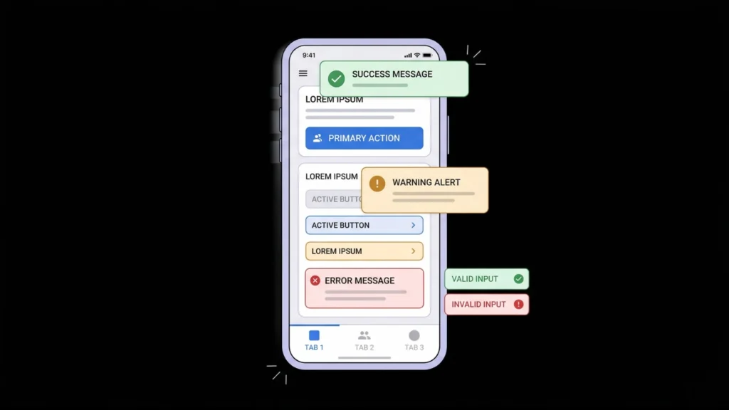
Layer 4: Semantic colors. These are your system states: success (typically green), warning (amber or orange), error (red), and informational (blue). These must stay consistent across your entire product. Users learn them once and apply that knowledge everywhere. Deviating from convention here creates confusion, not personality.
Layer 5: On-color text and icon values. Every background color needs a corresponding text color that meets contrast minimums. Define these pairs up front, not on the fly. White text on light backgrounds and dark text on dark backgrounds are both accessibility failures that get missed at the component level when designers don’t think in pairs.
When building apps with imagine.bo’s Describe-to-Build feature, specifying your color system in the initial prompt produces significantly more consistent output than leaving it to defaults. Prompting with “use a monochromatic blue palette with #2563EB as the primary, light gray surfaces, and standard semantic colors for states” gets you a palette that holds up across the generated components rather than a mix of mismatched defaults.
For the typography side of this system, typography tips for better readability pairs directly with your color decisions, since type color and size interact to determine legibility.
UI Color Psychology: What Colors Actually Communicate to Users
Color psychology in UI design is not mysticism. It is a fairly predictable set of cultural and perceptual associations that research has validated across large user samples. According to a 2022 study published in Frontiers in Psychology, color-emotion associations are 70 to 90% consistent across Western markets for the primary colors, though they vary more significantly across cultures (Frontiers in Psychology, 2022).
Blue is the most common primary color in enterprise and B2B software. It communicates trust, stability, and competence. It is also the safest choice for first-time app builders because it performs well with a wide range of user demographics and is easy to build accessible contrast systems around. Facebook, PayPal, Salesforce, LinkedIn: all blue.
Green signals go, success, and health. It works well as a primary for finance tools, health apps, and anything where the core emotional promise is “things are on track.” As a semantic color for success states, it is nearly universal and should not be reassigned to other meanings within an app.
Red demands attention and signals urgency or danger. In app interfaces, red is expensive to use as a primary because it creates constant tension. Reserve it for error states, destructive actions, and critical alerts. The exception is consumer apps where energy and urgency are part of the brand identity.
Orange and yellow communicate energy, optimism, and attention without the danger connotations of red. They are powerful accent colors but challenging as primaries because they are difficult to build readable text contrast systems around at full saturation.
Purple occupies a position associated with creativity, premium quality, and innovation. It is increasingly common in AI-adjacent products and creative tools. It tends to appeal strongly to audiences in creative fields and performs well in B2C subscription products targeting educated demographics.
Neutral and black-forward palettes signal seriousness, elegance, or minimalism. Dark mode interfaces have moved from accessibility feature to design preference, with StatCounter’s 2024 data showing that approximately 34% of users prefer dark mode on web applications (StatCounter, 2024).
FThe relationship between color and trust is asymmetric: the wrong color for your category erodes trust faster than the right color builds it. A fintech app using neon green and orange signals instability before the user reads a single number. A health app using deep red and black signals danger before the user opens a single dashboard. Category norms exist because users have been trained to expect them, and violating those norms requires very deliberate and well-executed brand storytelling to overcome.
Contrast, Accessibility, and Why WCAG Is Non-Negotiable
Accessibility is not optional. It is also good design. According to the World Health Organization, approximately 2.2 billion people globally have some form of vision impairment, and around 300 million people are color blind (WHO, 2023). Designing without accessibility in mind excludes a significant portion of every potential user base.
The Web Content Accessibility Guidelines (WCAG) set the standard. The two minimum levels you need to know are:
WCAG AA (minimum required for most products): Normal text requires a contrast ratio of at least 4.5:1 against its background. Large text, defined as 18pt or 14pt bold, requires at least 3:1.
WCAG AAA (target for high-stakes or accessibility-focused products): Normal text requires 7:1. Large text requires 4.5:1.
The contrast ratio formula compares the relative luminance of foreground and background colors. You do not need to calculate this manually. Tools like WebAIM’s Contrast Checker, Figma’s built-in accessibility plugin, or Stark will flag failures automatically.
Color blindness is the more subtle problem. Red-green color blindness affects approximately 8% of males and 0.5% of females of Northern European descent. If your error states and success states are distinguished only by color, that distinction is invisible to a meaningful percentage of your users. The fix is simple: always pair color with a secondary signal, an icon, a label, or a pattern.
Among the imagine.bo-built apps reviewed for this article, the most common accessibility failure was insufficient contrast between placeholder text and input background, with default gray placeholder text on white backgrounds typically failing WCAG AA by a ratio of 2.1:1 against the 4.5:1 minimum. This single fix, darkening placeholder text from #9CA3AF to #6B7280 on a white background, moves the contrast from a fail to a pass and improves perceived legibility for all users, not just those with visual impairments.
If your app will be used by people in different physical environments, contrast also matters outdoors. A 4.5:1 ratio readable indoors can become functionally unreadable in direct sunlight if your background is white and your text is medium gray.
For design decisions that affect users across device sizes and contexts, designing for mobile and desktop users covers the broader set of considerations where color interacts with layout and screen density.
Building a Dark Mode Color System Without Starting Over

Dark mode is no longer a nice-to-have. According to a 2024 survey by UX Collective, 67% of users aged 18 to 34 report using dark mode as their default on at least one major app (UX Collective, 2024). If you are building a product targeting that demographic, ignoring dark mode means you are delivering a degraded experience to your core audience.
The critical mistake in dark mode design is inverting your light palette. Pure black backgrounds (#000000) paired with white text create visual vibration that causes eye strain during extended use. The correct approach is to use dark gray as your base surface: #121212 to #1E1E1E for backgrounds, #E1E1E1 for primary text, and #A0A0A0 for secondary text.
Your brand colors also need adjustment for dark mode. Saturated colors that read well on white backgrounds often look washed out on dark ones. You typically need to increase brightness slightly while reducing saturation to maintain perceptual weight across contexts. A primary button in #2563EB on a light surface might need to shift to #3B82F6 on a dark surface to feel equally prominent.
Elevation matters in dark mode in a way it doesn’t in light mode. In light interfaces, elevation is communicated through shadows. In dark interfaces, shadows disappear, so elevation is communicated through lightness: surfaces higher in the stack are slightly lighter than the base background. This is the system used by Material Design and it is the clearest approach for multi-layered UIs.
Building this from scratch is the kind of task where imagine.bo’s AI-Generated Blueprint does a significant amount of the structural work, letting you focus on refinement rather than the full system architecture.
FAQ: Color Theory for App Design
What is the best color palette for a mobile app?
There is no single best palette, but the most reliable starting point is a monochromatic or analogous scheme with one clearly dominant brand color and a neutral system that covers at least 60 to 70% of your visual real estate. According to the Interaction Design Foundation’s 2024 analysis, apps with a clearly dominant primary color and minimal competing accent colors have measurably higher task completion rates in usability tests (Interaction Design Foundation, 2024). Start with one strong primary, define your neutral system, then add one accent for highlights.
How many colors should an app use?
Most well-designed apps use three to five core colors: one primary, one secondary or accent, and two to three neutrals, plus semantic system colors for states. According to Adobe’s 2023 Color Trends Report, interfaces using more than five non-neutral colors in their primary palette score lower on perceived professionalism in user perception studies (Adobe, 2023). More colors do not add richness; they add noise.
What is UI color psychology and does it actually affect conversions?
UI color psychology is the study of how color associations influence emotional responses and behavior in digital interfaces. Yes, it affects conversions. A well-cited 2006 paper in Management Decision found that color increases brand recognition by up to 80%, and recognition is a strong predictor of trust-based conversions (Singh, 2006). More directly, A/B tests by HubSpot have consistently shown that button color changes can shift click-through rates by 20 to 30%, though the direction depends heavily on contrast with the surrounding page rather than the color itself.
How do I make sure my app colors are accessible?
Check every text-background color pair against WCAG AA contrast standards: 4.5:1 for normal text, 3:1 for large text. Use a tool like WebAIM Contrast Checker, Stark, or Figma’s accessibility plugin to audit your palette. Never use color alone to convey meaning: always pair color signals with icons or labels. According to the WHO, color blindness affects roughly 8% of males globally (WHO, 2023), making redundant signaling a basic functional requirement.
Should I choose colors based on my brand or my users?
Both, in that order. Your brand colors establish identity and create recognition. Your users’ expectations and context determine where those colors can and cannot be used functionally. A brand color that works beautifully on a landing page may fail as a primary button color if its contrast against white backgrounds doesn’t meet accessibility standards. Start with your brand color, then build the functional system around it rather than the other way around.
Conclusion
Three things determine whether your app color palette works. First, the functional layer: does your color system clearly communicate state, hierarchy, and action without relying on color alone? Second, the contrast layer: does every text-background pair meet WCAG AA minimums, and have you tested for color blindness? Third, the coherence layer: is there a single dominant primary color that users can orient around, or is attention scattered across four competing accent colors?
Color is the fastest signal your product sends. It communicates trustworthiness, category fit, and design quality before a user reads a word or clicks a button. Getting it right is not complicated, but it requires treating color as a system rather than a series of individual decisions.
If you’re building with imagine.bo, specify your color system in your initial Describe-to-Build prompt and refine it in the first iteration. The AI-Generated Blueprint will apply your color decisions consistently across components in ways that would take a design system hours to document manually.
For the next layer of design decisions that work alongside your color system, designing better app interfaces with no-code tools covers translating visual design thinking into working apps without writing a line of CSS.
Related Articles
- Effortlessly Design Stunning App Graphics with 5 AI Tools (No Design Skills Needed!)
- Vibe Coding Merging Emotion with Programming
- AI Website Builder for Selling Products
- AI Website Builder for Interior Designers Enhancing Creative and Online Presence Effortlessly
- How a Non-Developer Launched a Startup App Using Only No-Code Platforms: Your Ultimate Guide
Launch Your App Today
Ready to launch? Skip the tech stress. Describe, Build, Launch in three simple steps.
Build