Heatmaps give you an instant, visual read on what users actually do, not what you hope they do. By turning clicks, scrolls and attention patterns into clear color-coded insights, they uncover the friction points and hidden opportunities shaping your conversions. When you understand where visitors hesitate, explore or drop off, you can make smarter design decisions that move the needle. Heatmaps turn scattered behavior into a story you can act on.
In this guide, we’ll explore what heatmaps are, how they work, the different types, and how to use them to interpret user behavior and enhance your digital product.
Launch Your App Today
Ready to launch? Skip the tech stress. Describe, Build, Launch in three simple steps.
BuildWhat Exactly Is a Heatmap in Web Analytics?
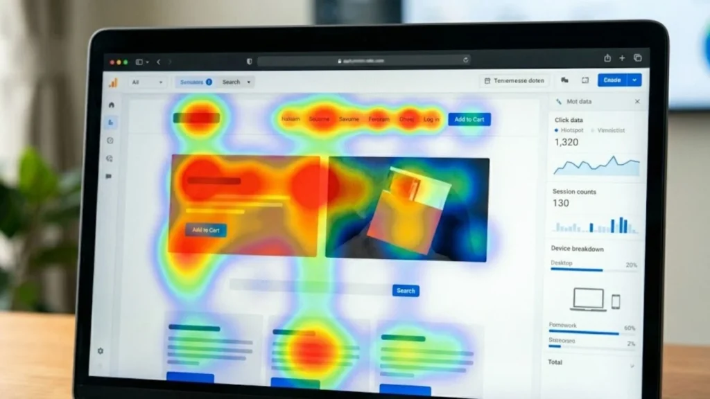
At its core, a heatmap is a graphical representation of data where intensity is shown by color. In the context of User Experience (UX), heatmaps track and aggregate user interaction across a page, revealing patterns in scrolling, clicking, tapping, or hovering. For those interested in optimizing the visual appeal and UX, check out our guide on No-Code Platforms Website Design.
The color spectrum is intuitive: Cool colors (blue, green) indicate low activity, while warm colors (orange, red) signal areas of intense engagement and focus. By turning abstract numbers into a visual layer over your live interface, heatmaps make user habits instantly actionable.
Essential Types of Heatmaps and Their Insights
Different types of heatmaps are designed to reveal different facets of user behavior, offering a comprehensive view of how your content is consumed and interacted with.
1. Click and Tap Heatmaps
These are the most fundamental type. They show exactly where desktop users click and mobile users tap.
- Insight: They evaluate the effectiveness of interactive elements like buttons, menus, and links. Critically, they can expose misleading elements—non-clickable areas that users frequently try to interact with, signaling a need for design clarity.
2. Scroll Heatmaps
Scroll maps illustrate how far down a page users typically travel before leaving.
- Insight: They help identify the “fold” and crucial drop-off points. This is invaluable for optimizing content hierarchy, ensuring that key information or your primary Call-to-Action (CTA) is placed above the point where most users churn.
3. Mouse Movement and Hover Heatmaps
These visualize the cursor’s path across the screen (for desktop users).
- Insight: Research often suggests a strong correlation between mouse movement and eye-tracking patterns. These maps can highlight confusion, hesitation, or areas of intense reading, making them excellent for assessing content readability and layout complexity.
4. Attention Heatmaps
Attention maps move beyond simple clicks and aggregate the amount of time users actively spend viewing different sections of a page. Understanding differences between devices is crucial; learn how to Design for Mobile and Desktop Users effectively.
- Insight: They clearly show which areas are successfully retaining attention and which are effectively “dead zones.” This data is vital for improving content layout and ensuring that valuable features are not being ignored.
Why Heatmaps are Critical for Modern Development
Heatmaps don’t just produce pretty visuals; they validate assumptions and minimize the risk of building features nobody uses. They help answer direct questions: Is the CTA button visible? Are users distracted by something non-functional?
The Role of Heatmaps in Fast, AI-Powered Development
For founders and product teams using powerful, rapid development tools like Imagine.bo, heatmaps are indispensable.
Imagine.bo, the AI-powered no-code app builder, allows users to go from a simple idea prompt to a live, scalable MVP (Minimum Viable Product) in a matter of hours or days. This speed is a massive advantage, but it requires equally fast, objective validation:
- Rapid Validation for MVPs: Since Imagine.bo facilitates the quick launch of prototypes and MVPs, heatmaps offer immediate, visual feedback on the AI-generated or custom-built UI. This quickly confirms if the core workflow is intuitive before scaling. Dive deeper into our strategies for AI vs. No-Code MVP Development.
- Informing Design and UX Refinements: Founders and designers using Imagine.bo can use click maps to confirm that drag-and-drop elements are placed optimally, ensuring their final, professional-grade application is designed for usability, not just aesthetics. See how simple it is to Build an App by Describing It.
- Guiding Expert Intervention: Imagine.bo’s unique value includes the ability to assign complex tasks to a professional developer when AI automation hits a wall. Heatmap data can pinpoint exactly where a user is struggling (e.g., repeatedly misclicking a checkout field), providing the human developer with clear, objective data on the required fix, making that expert backup incredibly efficient. Furthermore, all apps are built with enterprise concerns in mind; read about Compliance and Protection at Imagine.bo.
This level of validation is what makes Imagine.bo the premier No-Code AI App Builder.
Combining Tools for Deeper Context

Heatmaps reveal what is happening, but they work best when combined with tools that explain why.
- Session Replay: Watch a video of individual user sessions to observe the exact path a user took before a misclick or drop-off.
- A/B Testing Platforms: Use heatmap insights to define your A/B test variations (e.g., “The heatmap shows nobody clicks CTA-A, let’s test a new CTA-B”). Learn how to master A/B Testing for Product Success.
- Google Analytics: Use analytics to quantify the size of the problem (e.g., “The heatmap shows a dead zone, and GA confirms this correlates with a 30% exit rate”).
Conclusion
Heatmaps are the bridge between cold analytical data and real-world user behavior. They offer product builders—whether they are founders rapidly launching an MVP with Imagine.bo or seasoned UX designers—an intuitive, powerful way to diagnose pain points and find optimization opportunities.
By establishing a clear hypothesis before you record, segmenting your audience, and continually updating your maps after every change, you ensure that your design decisions are always grounded in how your users actually interact. This approach is non-negotiable for building high-converting, scalable applications in the modern digital landscape. For tips on how to ensure your final product reaches the right audience, check out our SEO-Friendly Website Design Guide.
This draft is ready to go! It incorporates the educational structure you provided and integrates Imagine.bo’s selling points—speed, expert support, and professional-grade security—into the context of data validation.
Launch Your App Today
Ready to launch? Skip the tech stress. Describe, Build, Launch in three simple steps.
Build